 Joybird
As Pantone’s “colour of the year 2025” is announced, we explore the paint shades that are trending now – and find out which colours can improve our mood.
Deciding on the colour of a room at home is a major commitment, as most of us will live with it for years or even decades. So you might think that following trends in paint colours and paint effects would be too impractical and costly to contemplate. In fact, though, paint colour trends have garnered a lot of attention lately. Domestic interiors are becoming steadily more daring in terms of colours, including vibrant and pop hues, but more commonly darker, moody, sometimes jewel-like shades. And they are hard to ignore. So what key trends are emerging and what influences are shaping them?
Bonnie Pierre-Davis, an interiors strategist with the WGSN trend-forecasting company, tells the BBC: “An interest in tinted darks has risen in previous seasons. It has been spotted on catwalks and throughout the automotive and interior product design industries, beginning with dark blues and now shifting towards purples… Consumers are slowly growing confident with this colour on walls for its therapeutic quality.”
Confirmation that certain colours are on-trend comes from all areas of culture, according to Carinna Parraman. “In the current series of Strictly Come Dancing (the UK TV version of Dancing with the Stars), the dancers’ costumes are deep plum, purples, dark teak, yellow and green.” Parraman is professor of design, colour and print at the Centre for Print Research, University of the West of England, Bristol, where she organises an ongoing series of online lectures on colour.
 Graphenstone
Previously, Pantone’s colour of the year has ranged from “peach fuzz” to “mimosa”. Their colour for 2025 is “mocha mousse”, a soft, beigey brown, and the colour will be announced this evening when London’s skyline is illuminated with the shade. The selection is made by the Pantone Color Institute‘s global trend-forecast team who are inspired by variety of influences, says Laurie Pressman, vice president of the institute. “These can include the entertainment industry and films in production, travelling art collections and new artists, fashion, all areas of design, aspirational travel destinations, new lifestyles as well as socio-economic conditions. Influences may also stem from new technologies, materials, textures and effects that impact colour, relevant social media platforms, and even upcoming sporting events that capture worldwide attention.”
“Paint brands used to be very prescriptive about colour trends,” says colour consultant Fiona de Lys. Certainly, there was a time when established paint trends seemed unassailable: take safe, anodyne magnolia, that reigned supreme throughout the 1980s. A step change came during the 1990s boom years of UK brand Farrow & Ball. “An evolution came when the company pushed the idea of rarefied colours with names like ‘elephant’s breath’,” says de Lys. “This gave rise to a tribalism whereby someone might walk into a person’s home and identify the paint colour, thereby affirming a shared knowledge of it, while also feeling very sophisticated.”
The greater choice of paints now on offer makes it harder for brands to predict whether a new colour trend or potential collection will take off. Dominic Myland, CEO of paint brand Mylands points out how subjective colour is: “Certain colours positively affect some people’s moods, but the same colours trigger a negative response in others,” he tells the BBC. When a brand launches a curated paint collection, it’s touch and go as to whether it will be a success. Little Greene’s “sweet treats” paint collection of rich browns, for example, named after desserts with names like “affogato” and “galette”, might be greeted with indifference by people who aren’t sweet-toothed.
As much as many of us might covet living in rooms painted in some of the currently fashionable, glamorously rich paint colours, are they really worth the risk? “A strong, deep, sonorous colour can and will completely transform the mood of a room,” advises Philippa Stockley, author of the books Restoration Stories, about restoring old houses, and Paint & Make. “Used knowingly and well, it can be incredibly dramatic; but the wrong strong colour can be unbearable. It’s essential to invest in tester pots when considering deep colours – and always paint them on a board that can be moved around the room because light can significantly change its appearance.”
Also, says Stockley, paint colours can change seasonally, which may partly explain the trend right now for rich, deep hues: “The current trend for warm-toned beiges, browns and fawns, for colours like thick, whipped, creamy hot chocolate, right through to true chocolate, melting and warm, velvety and consoling in effect, makes absolute sense.”
Here are nine paint colour trends to consider:
 Alamy
Alamy1. Mocha mousse
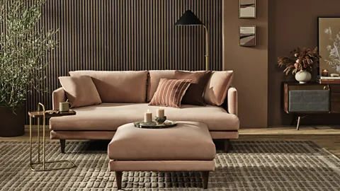
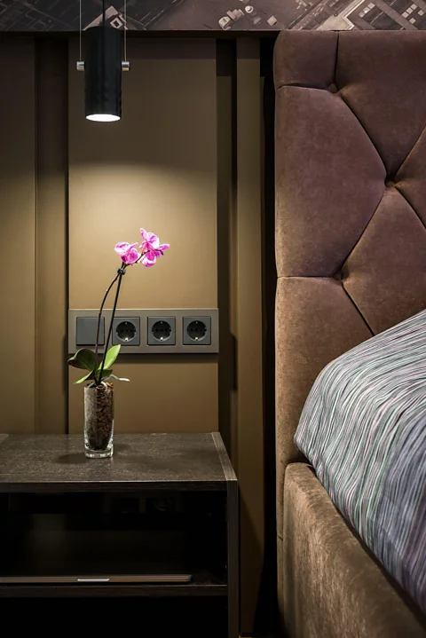
Pantone’s colour of the Year 2025, “mocha mousse”, suggests warming, frothing coffee or soothing hot chocolate, and by association evokes a mood of contentment and balance. Similar in shade to cocoa powder, this new hue also chimes with the trend for paint colours that conjure up food and drink. Arguably, the comforting quality of mocha mousse sends a subliminal message that, post-pandemic, we’ve come to appreciate simple, satisfying pleasures. This classically neutral colour also connotes understated luxury, translating well into interiors in the form of soft, tactile materials, such as suede and velvet covering sofas or headboards. By contrast, used as a paint colour and juxtaposed with white, its impact is sharp and crisp.
 Little Greene
2. Avocado and olive green
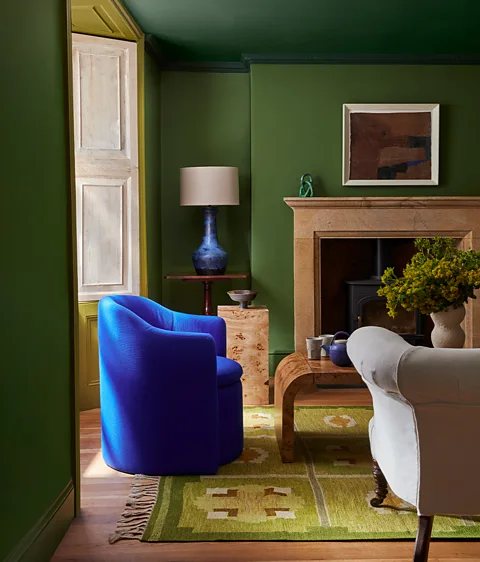
In this room, different shades of green cover almost every surface, creating an immersive effect. To achieve this colour-drenching look, three green tones by paint brand Little Greene have been used for three different types of surface in the room – an olive green shade called “hopper” for walls and skirting boards, a bottle green one for the ceiling and cornices, and a slightly acidic, lime green hue called “citrine” for the panelling surrounding the window, a clever way to intensify daylight entering the room. This desire to paint almost an entire room in three shades of one colour reflects a growing confidence among consumers to use colour more boldly, according to Ruth Mottershead, creative director of the brand. “An understanding of the effect of colour on a space’s atmosphere has grown exponentially over the past few years. And greens lend themselves well to such layering, given the presence of so many different yet harmonious shades of green we see in nature.”
 Graphenstone
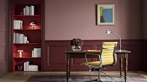
3. Burgundy and crimson
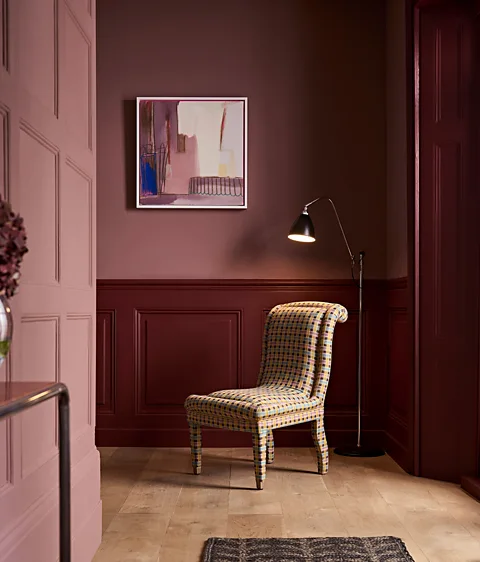
Three easily distinguishable surfaces in this room lend themselves to being painted in different but complementary warm tones. This mixing of colours or contrasting tones is favoured by Betsy Smith, a designer and creative director for Graphenstone. In this room, walls, wood panelling and the interior of the bookcase are differentiated using three paint colours – “cinnamon”, “carnelian” and “cinnabar”. “What’s important to me when using paint colours is to see how they interact,” she tells the BBC. “Two colours can enhance each other and have greater impact.” She describes the lighter wall colour here as “a rich, dusky pink that sits elusively between dusty earth, cocoa powder and mulberry”. The paint gives the impression of being powdery: “You can almost imagine running your fingers along the walls and the paint coming off like dried earth in your hands. Deeper tones look great on woodwork, which is offset here by vibrant red lining on the inside of the bookcase. It adds a pop of colour.”
 Neptune
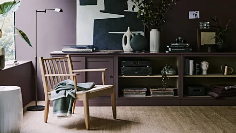
4. Plum and grape tones
This grape colour with a chalky, matt appearance is enveloping but not dark enough to feel oppressive. It’s called “clove” and is part of furniture company Neptune’s range of water-based paints that are low in VOCs (volatile organic compounds). Its mauve colour clearly doesn’t resemble the brown tinge of cloves used as a spice, but it’s deliberately conceived to be ambiguous and hard to pinpoint. “It summons images of juniper berries and dark wood,” says Fred Horlock, Neptune’s design director. “It hovers between a decadent plum shade and deep brown.” Yet despite its subtlety, the plum shade makes a strong statement because it’s a rare choice of colour. This is emphasised in this room, which evokes a bohemian, mid-century mood with its 1950s-style furniture, ceramics and abstract art.
 Mylands
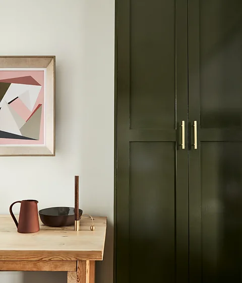
5. Deep moss green
We’ve seen avocado and olive green shades make a huge comeback in interiors. Now a more unusual, perhaps challenging, variation on the colour is emerging – a moodier, darker moss green, such as the green shade here, called “messel no 39”. It’s part of “the artist’s palette”, a new paint range for Mylands, created by Despina Curtis, co-founder of colour consultancy Etté. “The palette is inspired by the pioneering character of the Bloomsbury Group whose members encouraged freedom of expression through colour, and influence art and design to this day,” says Curtis. Moss green can be used sparingly, for example to highlight smaller areas, such as a door or cupboard, to avoid it looking overpowering. Not that Curtis sees it like that. “I see this deep green as meditative, tender, with soothing qualities, perhaps because it feels steeped in art history.”
 Little Greene
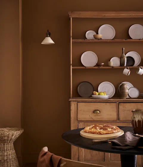
6. Rich brown
A taste for brown as a paint colour is one of the more surprising new colour trends. Browns can look dingy and muddy, but with the announcement of mocha mousse as colour of the year, we can expect to see browns adopted more widely in interiors. Here the walls are painted in Little Greene’s “galette” – part of the brand’s “sweet treats” palette, although this particular shade of brown looks restrained and utilitarian. Mottershead says that brown shades appeal because “they can provide a perfect backdrop for natural, rustic finishes, be they oak or darker woods and stone or quarry-tiled floors”. She says the trend reflects “a desire to surround ourselves with comforting, nurturing colours that provide serenity in our homes”. That said, the appeal of browns has its limits. They might suit kitchens like those in country houses or cottages, but could look flat and lifeless in rooms with little daylight, and out of place in very contemporary interiors.
 Rachael Smith
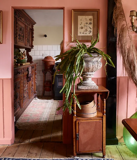
7. Dusty rose pink and terracotta
The dining room in Fiona de Lys’s Georgian cottage is painted two complementary shades – a fresh-looking pink shade called “rose” on the walls and a terracotta hue, “Etruscan brown”, on tongue-and-groove woodwork (both paints are from Edward Bulmer). De Lys describes the darker hue as “a shadow colour”. “It recalls the shadow cast by a projecting slab of stone on a building hit by the sun,” she says. “I choose colours for my home that reflect my aesthetic heritage and evoke specific feelings and emotions.”
De Lys is half-Italian, and the colours in her dining room have strong associations with Liguria, where she spent some of her childhood, and where she frequently stays now. “The colours evoke trompe l’oeil paintings found in Liguria. The room’s warm colours recall soil and food cultivated in it, and so are nice to be surrounded by when eating here. The room is north-facing – another reason why I chose warm colours.” Such colours are likely to have a broad appeal, especially among people who love nature and the countryside, she says: “Unconsciously we’re drawn to pink and brown shades because on a primitive level they reflect colours found in the soil. They feel grounding.”
 Little Greene
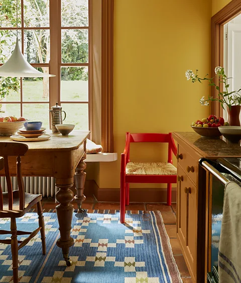
8. Warm, golden yellows
Yellows with a hint of brown or orange is another major trend at the moment. The ceiling colour shown here is “middle buff” by Little Greene. “This is an intriguing, deep neutral colour that makes a surprising, grounding partner to stronger yellows,” says Mottershead. A slightly cleaner shade – “yellow pink” – was used on the walls. Once again, the double-drenching approach has been used here, resulting in a solid yellow backdrop that makes the chair painted a scarlet hue look all the more zingy. Stockley speculates that the gold or orange-tinged yellows may have been boosted by the paintings of Van Gogh, in particular his use of radiant yellows in the work he created in Arles in the South of France. “The current blockbuster Van Gogh show at the National Gallery, London, is a delight for many reasons,” she says. “One of these is that in this particular set of paintings, Van Gogh used almost no black. One reason the exhibition is so exhilarating is the refractive sparkle of all the bright, light-toned paintings, singing so joyfully, scarcely depressed by a hint of black.”
 Rachel Chudley
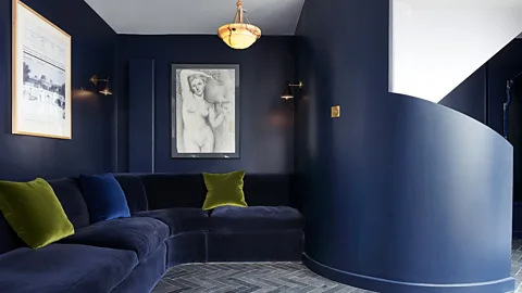
9. Ultramarine
Interior designer Rachel Chudley chose this sumptuous ultramarine shade – “plimsoll” by Paper and Paint Library – for a space at the foot of a staircase in a home in Bloomsbury, London. “A deep blue colour against the light tone of the staircase gives drama and personality to this small under-stairs area, while also making it feel cosy,” she says. Chudley is known for her exuberant yet considered use of colour, which has long been a hallmark of her projects. Her interest in individually blended paint is in step with the current growing demand for bespoke colours and curated paint ranges.
Source: BBC Culture – www.bbc.com


